

Cosychem's new logo goes online and starts from a new starting point
- Categories:Company News
- Author:
- Origin:
- Time of issue:2021-10-22 09:32
- Views:
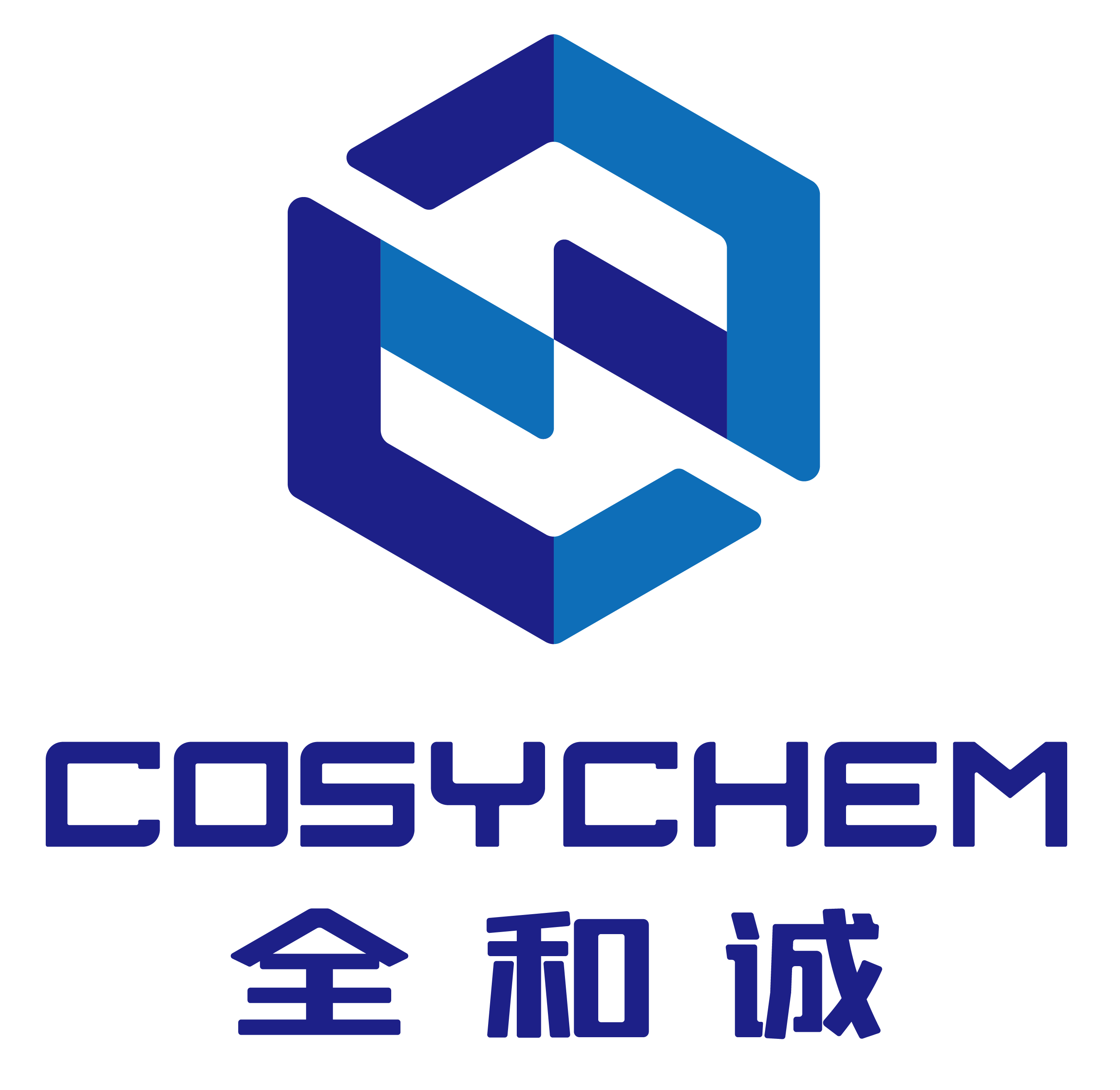
(Summary description)Enterprise logo is an important part of the enterprise culture system, an important way for the audience to form a good perception of the enterprise, and also an important support and carrier of the enterprise brand image. In recent years, with the major adjustment of the enterprise development strategy and the profound change of the management system, the enterprise reform and development has opened a new journey. In order to further improve the company's image and shape the industry brand, the company has comprehensively optimized and improved the old logo. The overall style of the new logo: simple, modern, scientific and international. The whole figure is a two-color regular hexagon design. The regular hexagon connects from the center to each fixed point as an equilateral triangle, which is the most stable and symmetrical shape; The hexagon is between the square and the circle as a whole, which has the meaning of "Six Harmonies", matches the company's concept of "Going all out, Harmonious coexistence, Integrity and win-win", and reflects the company's development concept and industry characteristics. The graph is divided into two parts, which is a combination of two hands, expressing the communication and cooperation between enterprises and customers, and integrating the C & C concept extracted from brand name and positioning. Font design has a sense of science and technology and professionalism, with specificity and coordination with graphics. The logo color selects two kinds of blue, dark blue, profound technology, to express the infinite possibility of science; Light blue is lively and young, implying the vitality and vitality of the company. The replacement of our new logo is not only an innovation of brand image, but also a new start. We will always adhere to the concept of "Going all out, Harmonious coexistence, Integrity and win-win", continue to devote ourselves to R & D and production of high-tech products, constantly optimize customer service, and promote the development of the pharmaceutical industry with innovative scientific and technological achievements.
Cosychem's new logo goes online and starts from a new starting point
(Summary description)Enterprise logo is an important part of the enterprise culture system, an important way for the audience to form a good perception of the enterprise, and also an important support and carrier of the enterprise brand image. In recent years, with the major adjustment of the enterprise development strategy and the profound change of the management system, the enterprise reform and development has opened a new journey. In order to further improve the company's image and shape the industry brand, the company has comprehensively optimized and improved the old logo.
The overall style of the new logo: simple, modern, scientific and international. The whole figure is a two-color regular hexagon design. The regular hexagon connects from the center to each fixed point as an equilateral triangle, which is the most stable and symmetrical shape; The hexagon is between the square and the circle as a whole, which has the meaning of "Six Harmonies", matches the company's concept of "Going all out, Harmonious coexistence, Integrity and win-win", and reflects the company's development concept and industry characteristics. The graph is divided into two parts, which is a combination of two hands, expressing the communication and cooperation between enterprises and customers, and integrating the C & C concept extracted from brand name and positioning. Font design has a sense of science and technology and professionalism, with specificity and coordination with graphics. The logo color selects two kinds of blue, dark blue, profound technology, to express the infinite possibility of science; Light blue is lively and young, implying the vitality and vitality of the company.
The replacement of our new logo is not only an innovation of brand image, but also a new start. We will always adhere to the concept of "Going all out, Harmonious coexistence, Integrity and win-win", continue to devote ourselves to R & D and production of high-tech products, constantly optimize customer service, and promote the development of the pharmaceutical industry with innovative scientific and technological achievements.
- Categories:Company News
- Author:
- Origin:
- Time of issue:2021-10-22 09:32
- Views:
Enterprise logo is an important part of the enterprise culture system, an important way for the audience to form a good perception of the enterprise, and also an important support and carrier of the enterprise brand image. In recent years, with the major adjustment of the enterprise development strategy and the profound change of the management system, the enterprise reform and development has opened a new journey. In order to further improve the company's image and shape the industry brand, the company has comprehensively optimized and improved the old logo.
The overall style of the new logo: simple, modern, scientific and international. The whole figure is a two-color regular hexagon design. The regular hexagon connects from the center to each fixed point as an equilateral triangle, which is the most stable and symmetrical shape; The hexagon is between the square and the circle as a whole, which has the meaning of "Six Harmonies", matches the company's concept of "Going all out, Harmonious coexistence, Integrity and win-win", and reflects the company's development concept and industry characteristics. The graph is divided into two parts, which is a combination of two hands, expressing the communication and cooperation between enterprises and customers, and integrating the C & C concept extracted from brand name and positioning. Font design has a sense of science and technology and professionalism, with specificity and coordination with graphics. The logo color selects two kinds of blue, dark blue, profound technology, to express the infinite possibility of science; Light blue is lively and young, implying the vitality and vitality of the company.
The replacement of our new logo is not only an innovation of brand image, but also a new start. We will always adhere to the concept of "Going all out, Harmonious coexistence, Integrity and win-win", continue to devote ourselves to R & D and production of high-tech products, constantly optimize customer service, and promote the development of the pharmaceutical industry with innovative scientific and technological achievements.


Copyright © 2021 COSYCHEM Powered by www.300.cn 津ICP备18010187号